How I designed this Theme
Published 2024-05-29
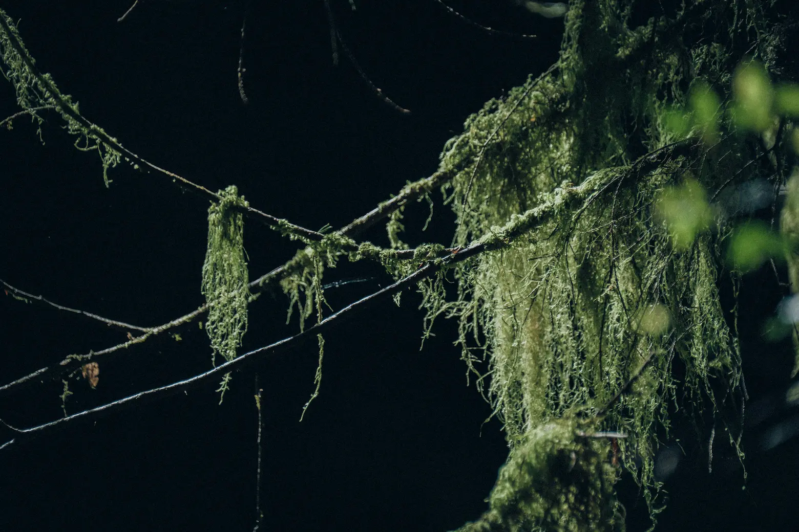
Photo by me, published to Unsplash copyright free.
This is a simple gohugo theme that I’ve been wanting to develop for some time. It doesn’t use a CSS framework but a smallish custom CSS file, uses a system font stack, contains no Javascript, utilizes bootstrap icons through SVG, respects dark vs light mode of the user, loads fast, and follows a minimalist/utilitarian/brutalist design. All while looking great and being responsive, supporting modern browsers. Importantly, it tries to follow a designed-to-last mentality.
Examples (this is a Level 2 header)
- Here is emphasis
- Here is bold
- Here is
cross out
Here’s a table of important websites. It’s just a sample of what a table looks like in this theme, but I will be writing a full post on this in the future!
| Website | Why it’s important |
|---|---|
| https://en.wikipedia.org | It has most of human knowledge in a readable, reliable format. One of the coolest things to ever exist! |
| https://reddit.com or https://old.reddit.com | Even tho they mnade a deal with Google recently to train AI on their users, and the shitty behavior of the company against the volunteer mods make Reddit a part of the enshittification of the Internet, it is still one of the last places left to look for real people asking questions in a forum with diverse opinions and real-life experience. Too often, search results are just SEO’d garbage. |
| https://web.archive.org | The Internet is forever. |
| https://weather.gov | The best place to see weather stuff and the forecast discussions are often interesting. |
| https://genderdysphoria.fyi/ | “The purpose of this site is to document the many ways that Gender Dysphoria can manifest, as well as the numerous forms of gender transition, in order to provide a guide for those who are questioning, those who are starting their transgender journey, those already on their path, and those who simply wish to be better allies.” |
| https://theguardian.com/us | Probably the best current news source out there. No goddamn paywall, sensible reporting. |
| https://pmc19.com/data | Best site for current COVID data. |
We can talk about code by talking about things like the sudo command with single backticks inline (or as an alternative to kbd like control + alt + delete), or we could do code blocks with supported languages with the Dracula theme:
$ sudo apt install test

sudo apt update && sudo apt upgrade

touch newfile.md

cat this is some text >> newfile.md
Here is what a link looks like and here is a block quote:
It is always brave to insist on undergoing transformations that feel necessary and right even when there are so many obstructions to doing so, including people and institutions who seek to pathologize or criminalize such important acts of self-definition. I know that for some it feels less brave than necessary, but we all have to defend those necessities that allow us to live and breathe in the way that feels right to us. Surgical intervention can be precisely what a trans person needs–it is also not always what a trans person needs. Either way, one should be free to determine the course of one’s gendered life.
— Judith Butler
Both light-mode and dark-mode styling allows for a:visited but with different styling.
Info box example
Info boxes with a dedicated customshortcode are supported. You can input a custom title at the top and then this text. It also pipes to markdownify. The gradient colors are different between dark and light modes. =) Level 3 headings are the lowest heading
The idea is to minimize level 3 headings all-together and just use level 1 and level 2 headings. I’m following Edward Tufte and Richard Feynman’s example:
[It is] notable that the Feynman lectures (3 volumes) write about all of physics in 1800 pages, using only 2 levels of hierarchical headings: chapters and A-level heads in the text. It also uses the methodology of sentences which then cumulate sequentially into paragraphs, rather than the grunts of bullet points. Undergraduate Caltech physics is very complicated material, but it didn’t require an elaborate hierarchy to organize.
— Edward Tufte, forum post, ‘Book design: advice and examples’ thread
Media
Images are always hard to get right. Too many images or images that aren’t optimized correctly or not displaying alt-text can take away from a good browsing experience.1 Same with images not displaying well on different viewports.
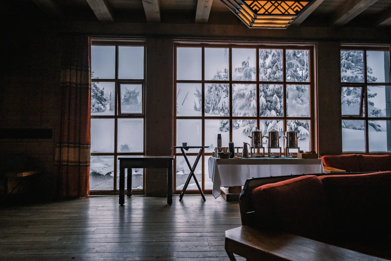
The below photo is displayed with the Hugo figure shortcode as such:
{{< figure src="/webp/DSCF9808.webp" link="/highres/DSCF9808.jpg" alt="The picture shows a point-of-view angle of looking at a large set of windows with snow outside and coffee dispensers on a table" caption="*Inside Timberline Lodge*. Fujifilm X-T4 | f/2.8 | 0.002 | 16mm | ISO400." >}}

Inside Timberline Lodge. Fujifilm X-T4 | f/2.8 | 0.002 | 16mm | ISO400.
Note that the src is to a webp in its own directory and it links to a highres version also in its own directory. The process for this is to:
- Take the edited jpg and use https://squoosh.app to output a webp photo at a reasonable pixel size (it goes from 11.5 MB to 164 KB!!!)
- Place the squooshed webp into the
webpdirectory and the original jpg into thehighresdirectory - Create the shortcode for the photo in the markdown document
- Enter the alt-text and caption with optional EXIF
The reason for this process is that I want the website to load fast and the images to not be unwieldy but to allow for people to see or download the full-res images if they’d like to. I also often lazy load images not in the immediate viewport with loading="lazy" in the figure shortcode.
It also allows me to link the full-res version and send it to people directly if they ask me to SMS it to them or email it to them. I’m not super interested in a traditional gallery style page, but I will make a post on here that will be titled something similar to Photography Portfolio where the images will be placed just like they are on this page. I plan to create posts when I want to talk about or post a new photo. It will then be published to IG, etc.
Other aspects
This theme has a few other aspects that are worth highlighting:
- When a post has
lastmodin the frontmatter, it is listed in the blog order with the lastmod date. This will allow modified posts to show up near the top of the blogroll when edited. - The date format is the year in ISO8601
- Sticky top bar for navigation
- Easily plug in the homepage links to the
config.tomlwith Bootstrap icons - RSS link because RSS is fucking cool!
- When selecting text, the text is yellow
-
This is what a footnote looks like. I spent hours trying to get
scroll-margin-topworking with the sticky header!! ↩︎